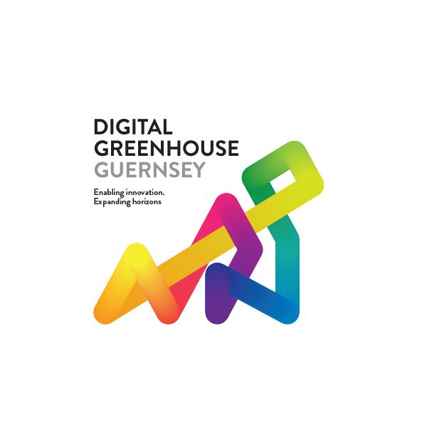

1. The basis for the logo is the shape of Guernsey.
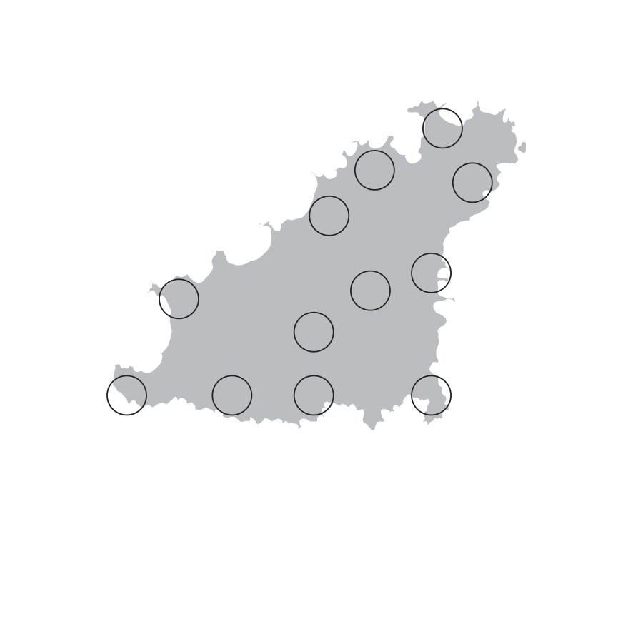
2. A series of circles are placed at points around the island and the interior.
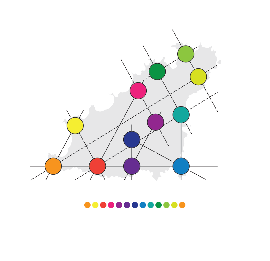
3. Although random in appearance, the centrepoints of these circles meet using a series of intersecting angles. A spectrum of colours are applied to the circles.
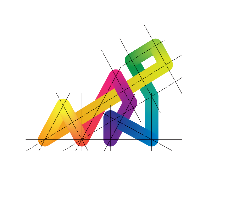
4. The spectrum of colours are then blended together to make an abstract continuous colourful shape. This shape represents Guernsey and a bright, continuous evolving landscape.
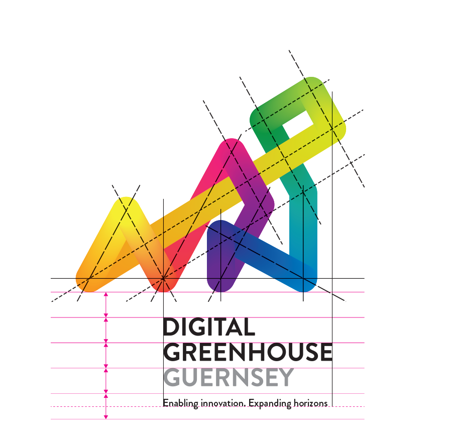
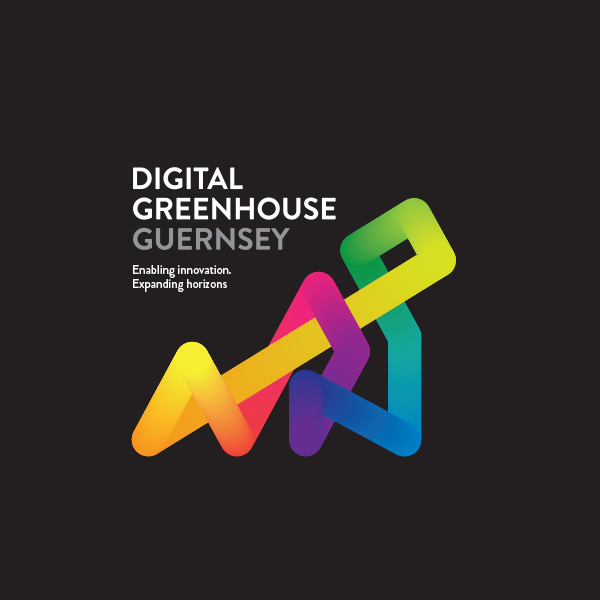
5. Rules are applied to the positioning and leading of the name and strapline.
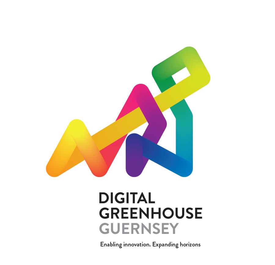
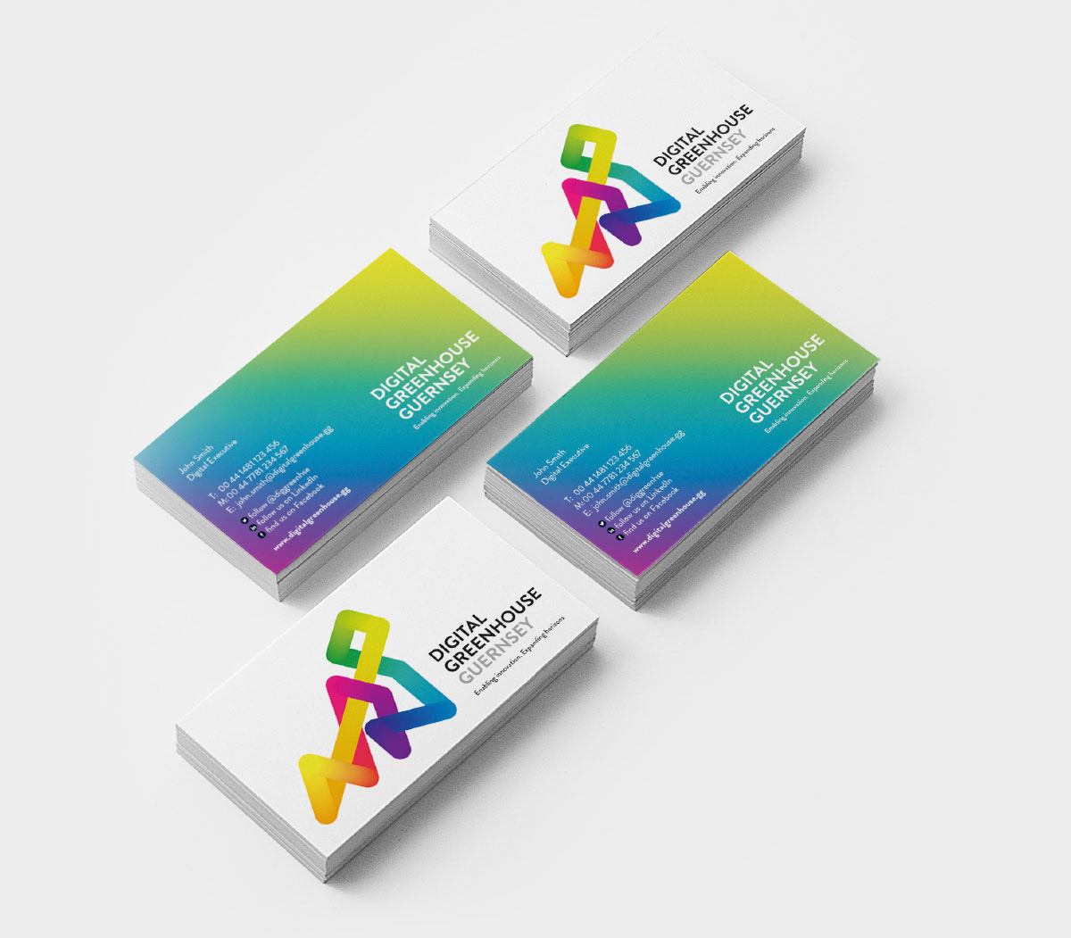
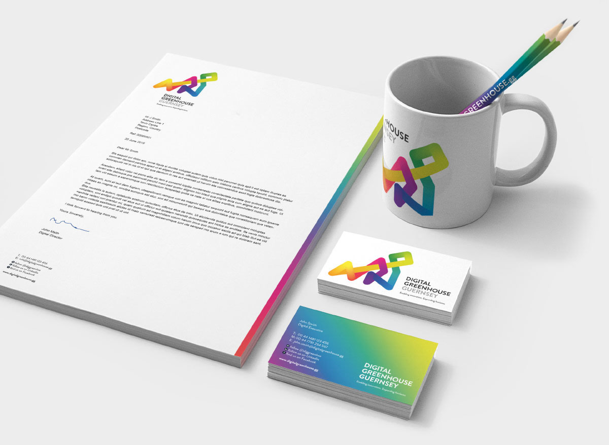
6. The brandmark can work in isolation. Both Guernsey and, or the strapline can also be removed if required, reducing the name to DIGITAL GREENHOUSE.